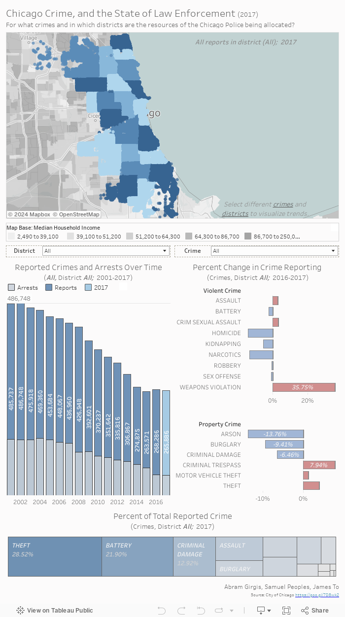
Answer the following questions to better understand the dashboard above.
- Within each shaded blue region on the map, what variable remains constant? Or rather, what do the colors represent?
- Explore the map; what do the different shades of gray represent?
- For all districts, which crime comprised the largest proportion of total crime reported in 2017?
- Hint: Look at the bottom visualization.
- For all districts, which crime increased the most from 2016 to 2017?
- Hint: Look at the Percent Change visualizations on the right.
- What is the general trend for all reported crimes over time?
- Hint: Look at the Crimes and Arrests over time on the left.
- Change the district parameter from the drop down menu. What changes occur in the visualizations below? What about for the crime parameter?
- What general trends do you see with respect to different crimes and median household income when changing various parameters? In which districts are the most crimes seemingly reported?