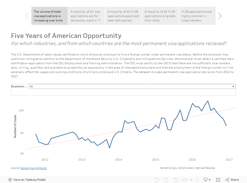
Seen above is a network developed from the microbial communities of fecal samples from patients labeled as "
Obese" and "
Lean". There have been a lot of studies which have measured what's called the "beta diversity" to show that dissimilarity exists between the microbial communities of obese individuals, and I was curious about the conclusions one could draw from the perspective of a network.
The
blue nodes are samples that are "
Lean", while the
red nodes are samples labeled "
Obese". The distal
pink nodes are what are called "
Operational Taxonomic Units" which represent microorganisms, and classifies groups of closely related individuals. The nodes are
sized based on their
degree, which represents the frequency that connections are made to the node. The
purple lines are transparent based on a function of their
edge weight, and the animation fades between the selection of "
Obese" samples and their first neighbor in the network only, and the respective "
Lean" view.
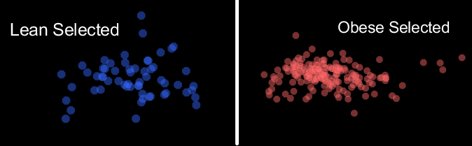
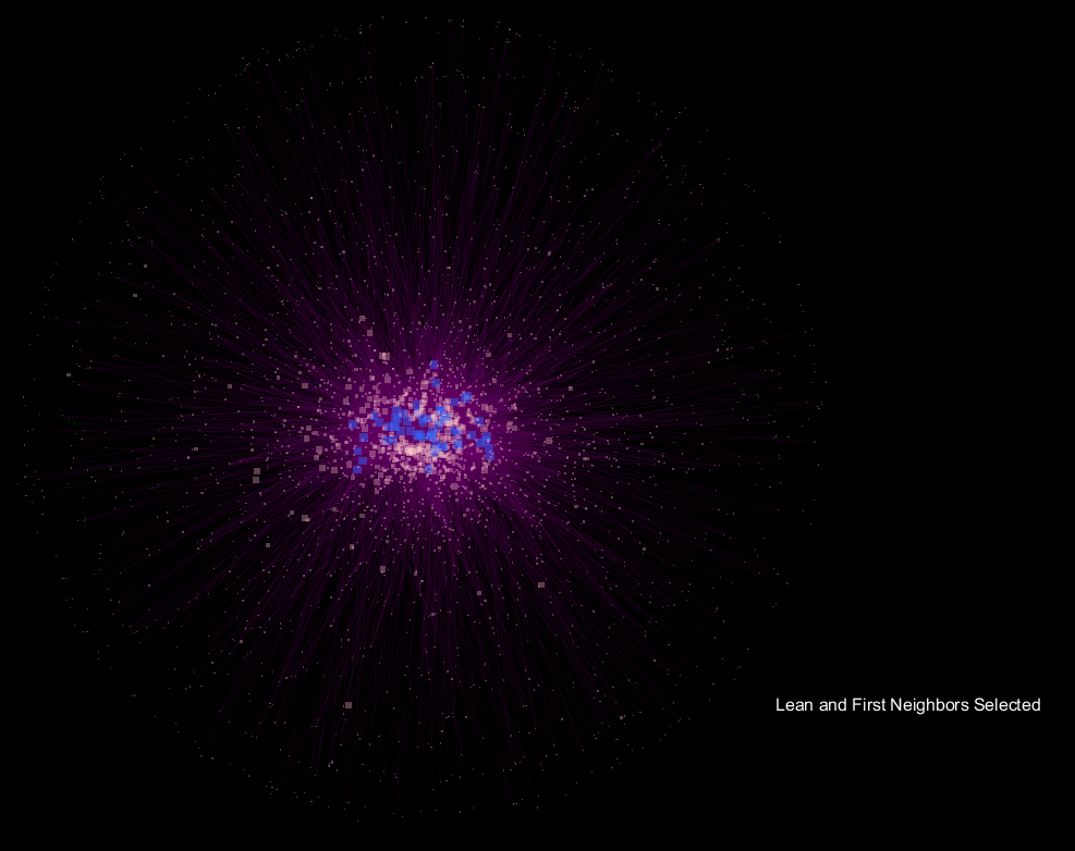
The network is configured using an "
Edge-weighted Spring-Embedded Layout"; from the Cytoscape webpage, the spring-embedded layout is based on a “force-directed” paradigm as implemented by Kamada and Kawai (1988). Network nodes are treated like physical objects that repel each other, such as electrons. The connections between nodes are treated like metal springs attached to the pair of nodes. These springs repel or attract their end points according to a force function. The layout algorithm sets the positions of the nodes in a way that minimizes the sum of forces in the network.
The seemingly "explosive" nature of the visualization with respect to "
Obese" samples translates to more connections in the network being made to a more diverse community of microorganisms, and supports the notion that obese samples have a more diverse gut microbiome when compared to lean samples. What's interesting is that the orientation is preserved, so shared OTU nodes are easily spotted, while the large increase in nodes for "
Obese" samples can be readily observed. These shared OTUs are representative of the core shared microbiome.
Background
As a part of my Computational Biology course at the University of Washington, I was tasked with creating a statistically-backed visualization of a biological process or simulation. I had previously done an exploratory analysis of Jeff Gordon's
A Core Gut Microbiome of Obese and Lean Twins, and I was interested in whether there were measurable and visual differences in the network developed from microbial communities of lean and obese twins. In my previous exploratory analysis, I had measured the dissimilarity of the sample operational taxonomic unit using a
weighted-unifrac metric, which resulted in a measurable dissimilarity of the beta diversity of obese samples, which is pretty interesting to me! Jeff Gordon's study drew three core conclusions, which directed this project:
- Wide array of shared genes; there exists a core microbiome at the gene level.
- Obesity is associated with phylum-level changes in the microbiota.
- Deviations from this core microbiome are associate with physiological states.
Visualization
A link to the specific data can be found here:
The following preprocessing was done using Qiime2 Python scripts:
- Rarify the table for increased accuracy.
- Filter any samples that you are not analyzing. Here, we do not want 'Overweight' samples.
- Make the otu network with the filtered biom and mapping file, here we wanted properties based on "obesitycat"
From here, the visualization was completed with Cytoscape. The increased density of the Obese selection, when compared to the Lean selection suggests that the microbiome of Obese individuals varies much more widely than Lean samples. However, I'm no biologist.
Here are some other images from the visualization:
Statistics & Python Script
The following slides are a simple test case, designed to explain the basic functions of the script.
Running the script on the lean-obese data display that the degree for OTU nodes that are associated with "Obese samples only" significantly exceeds that of "Lean-only" samples. This translates to a greater diversity of the Obese sample microbial communities, of which are outside the core microbiome.
| Category |
Min |
Q1 |
Mean |
Median |
Q3 |
Max |
StdDev |
| Lean |
206.103 |
248.114 |
271.906 |
271.788 |
296.252 |
344.526 |
35.574 |
| Obese |
163.965 |
246.257 |
275.77 |
280.659 |
308.187 |
363.067 |
46.73 |
| OTU_LeanOnly |
1.0 |
1.00 |
1.435 |
1.01 |
1.809 |
4.185 |
0.759 |
| OTU_ObeseOnly |
1.0 |
1.003 |
2.732 |
1.644 |
3.016 |
16.614 |
3.154 |
| OTU_Both |
2.067 |
6.385 |
24.117 |
14.049 |
31.4 |
119.475 |
26.959 |
There is a wider distribution of "Obese" samples, when compared to those that are "Lean", which is representative of a more diverse gut microbiome. The core OTU nodes represent the band of shared OTUs.
OTUs associated with Lean-Only nodes have a low mean degree when compared to those of Obese-only nodes. The higher degree of Obese-only nodes supports the notion of deviations from the core microbiome being associated with physiological states; in this case, Obesity.