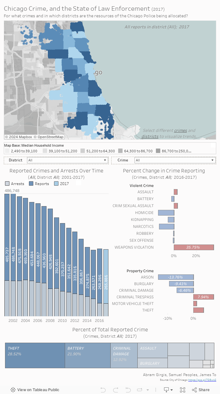
Answer the following questions to better understand the dashboard above.
Within each shaded blue region on the map, what variable remains constant? Or rather, what do the colors represent?
Explore the map; what do the different shades of gray represent?
For all districts, which crime comprised the largest proportion of total crime reported in 2017?
Hint: Look at the bottom visualization.
For all districts, which crime increased the most from 2016 to 2017?
Hint: Look at the Percent Change visualizations on the right.
What is the general trend for all reported crimes over time?
Hint: Look at the Crimes and Arrests over time on the left.
Change the district parameter from the drop down menu. What changes occur in the visualizations below? What about for the crime parameter?
What general trends do you see with respect to different crimes and median household income when changing various parameters? In which districts are the most crimes seemingly reported?
A more interesting assignment from my Data Analysis and Visualization course at the University of Washington involved creating a static visualization of U.S. Census data from 1900 and 2000. Here's a sample of what we started with.
This visualization was approached with the question: “Does comparing the
population of different age groups reveal insights which support or oppose the idea of
an ['aging population'] in the United States?” With a few adjustments, the data can tell
us a lot more than we think.
I began by encoding the Gender to “Men” and “Women”, and calculated the
“Percent of Total Population” for each cell. This was accomplished by dividing each cell
by the sum of all the values with the same “Year”. The year in which each age group was
born was then calculated by subtracting the “Age” from the “Year”, and it was saved as
“YearBorn” and used in the Tooltip.
Once all the necessary variables were assigned, I
could then proceed with the analysis and comparisons. By standardizing the population
with percentages, the differences in magnitude can be removed, although the individual
values are immediately hidden. The differences between the genders is seemingly
negligible, so it is appropriate to combine their values for a majority of the analysis.
When experimenting with different charts and graphs, the area graph was chosen
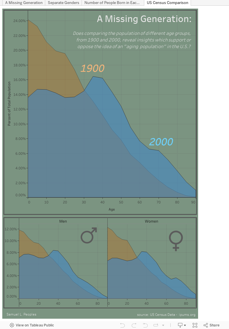
to best represent the change in demography at these two snapshots in history. The most beneficial aspect of the area charts is that the shaded regions all sum to 100%, so direct comparisons can be made. The two
graphs are overlayed upon one another and the stark differences can be seen, where
blue and orange were used for their ability to capture attention, and help distinguish
the two years from each other within the same chart. There is a significantly lower
proportion of individuals born between 1965 and 2000, which does not follow the same
trend as the rest of the visualization. This suggests that fertility rates significantly
dropped around this time, and is supported by the fact that [oral contraceptives were first approved by the Food and Drug Administration in 1960]. This reduction has
increased the median age of the United States, which is apparent from the space
between the overlayed charts, where there are more individuals above the age of 40
comprising the total population in 2000, when compared to the proportion from 1900;
this is roughly a constant three percent increase. This difference in proportion is taken
from individuals under the age of 40, which is most apparent with the over ten percent
difference of newborns, where this age group represented over twenty-four percent of
the population in 1900, while they made up less than fourteen percent of the population
by 2000.
Because the median age of the United States has increased and the
representation of younger people in the national census has dramatically decreased,
signs of an aging population can be observed. The use of area graphs to represent
population proportions versus age is optimal for this question, where the true values
are not immediately shown. However, hovering over points and selecting different
portions of the visualization reveals these values, as well as information about when the
age group was born, which helps guide the viewer through the data. This dataset is
incredibly useful in the educational setting, where budding analysts are tasked with
manipulating and contorting the data to reveal valuable insights. Initially viewing the
data without standardization results in an opposing conclusion, which has the
possibility of leading people to incorrect, or uninformed decisions. Although
technology allows us to quickly analyze and understand huge datasets, it can be initially
overwhelming, and exercises such as this are a great way to learn what does, and doesn’t
work.
Select the different colored portions of the visualization. Does this change the information you can see?
Hover over the chart and describe the "Percent of Total" and number of people aged 40 in 1900, and 2000. Why is the population so much greater, when the proportion is lower?
What differences between individuals under 40 exist, and what does this suggest about the fertility rate of the United States?
In the area charts below, which gender appears to live the longest in the year 2000?
What is the general relationship between the genders?