
This visualization was approached with the question: “Does comparing the population of different age groups reveal insights which support or oppose the idea of an ['aging population'] in the United States?” With a few adjustments, the data can tell us a lot more than we think.
I began by encoding the Gender to “Men” and “Women”, and calculated the “Percent of Total Population” for each cell. This was accomplished by dividing each cell by the sum of all the values with the same “Year”. The year in which each age group was born was then calculated by subtracting the “Age” from the “Year”, and it was saved as “YearBorn” and used in the Tooltip.

Once all the necessary variables were assigned, I could then proceed with the analysis and comparisons. By standardizing the population with percentages, the differences in magnitude can be removed, although the individual values are immediately hidden. The differences between the genders is seemingly negligible, so it is appropriate to combine their values for a majority of the analysis.
When experimenting with different charts and graphs, the area graph was chosen to best represent the change in demography at these two snapshots in history. The most beneficial aspect of the area charts is that the shaded regions all sum to 100%, so direct comparisons can be made. The two graphs are overlayed upon one another and the stark differences can be seen, where blue and orange were used for their ability to capture attention, and help distinguish the two years from each other within the same chart. There is a significantly lower proportion of individuals born between 1965 and 2000, which does not follow the same trend as the rest of the visualization. This suggests that fertility rates significantly dropped around this time, and is supported by the fact that [oral contraceptives were first approved by the Food and Drug Administration in 1960]. This reduction has increased the median age of the United States, which is apparent from the space between the overlayed charts, where there are more individuals above the age of 40 comprising the total population in 2000, when compared to the proportion from 1900; this is roughly a constant three percent increase. This difference in proportion is taken from individuals under the age of 40, which is most apparent with the over ten percent difference of newborns, where this age group represented over twenty-four percent of the population in 1900, while they made up less than fourteen percent of the population by 2000.
Because the median age of the United States has increased and the representation of younger people in the national census has dramatically decreased, signs of an aging population can be observed. The use of area graphs to represent population proportions versus age is optimal for this question, where the true values are not immediately shown. However, hovering over points and selecting different portions of the visualization reveals these values, as well as information about when the age group was born, which helps guide the viewer through the data. This dataset is incredibly useful in the educational setting, where budding analysts are tasked with manipulating and contorting the data to reveal valuable insights. Initially viewing the data without standardization results in an opposing conclusion, which has the possibility of leading people to incorrect, or uninformed decisions. Although technology allows us to quickly analyze and understand huge datasets, it can be initially overwhelming, and exercises such as this are a great way to learn what does, and doesn’t work.
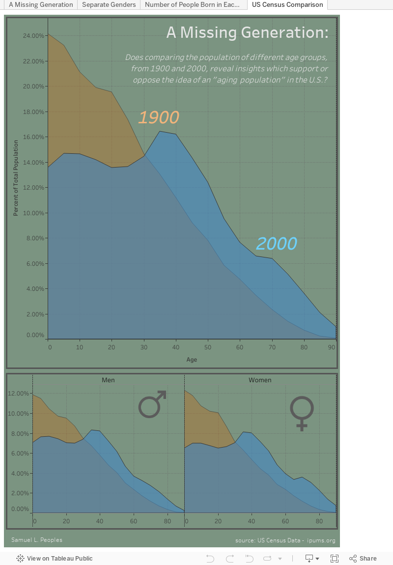
- Select the different colored portions of the visualization. Does this change the information you can see?
- Hover over the chart and describe the "Percent of Total" and number of people aged 40 in 1900, and 2000. Why is the population so much greater, when the proportion is lower?
- What differences between individuals under 40 exist, and what does this suggest about the fertility rate of the United States?
- In the area charts below, which gender appears to live the longest in the year 2000?
- What is the general relationship between the genders?
ReplyDelete1. Select the different colored portions of the visualization. Does this change the information you can see? : Yes. The values of the data are shown for specific points and the colored areas are focused.
2. Hover over the chart and describe the "Percent of Total" and number of people aged 40 in 1900, and 2000. Why is the population so much greater, when the proportion is lower?: We notice that the population is greater and the total number of 40 year olds is greater in 2000 than in 1900. This could be possible due to the baby boomer generation.
3. What differences between individuals under 40 exist, and what does this suggest about the fertility rate of the United States? The difference in the number of newborns and under 40 year olds between 1900 and 2000 suggest that the fertility rates are were higher.
4. In the area charts below, which gender appears to live the longest in the year 2000?: Females live longer than males, there proportion is greater in both years.
5. What is the general relationship between the genders?: It is clear that females have outlived males in 1900 and 2000. This then brings up the question as to why?
This visualization and blog post is incredibly done. The introduction paragraph as too the purpose of this data gives a good motivation to look into the data and make these visualizations. The questions themselves are well guided and asked. Asking the user to explore the mechanics of the visualization and observing the behaviors push the user to make their own discoveries. In terms of the visualization. It is beautiful and easy to navigate through. The intersection of the areas lets the differences between both data sets really stand out to the reader.
End User Question:
ReplyDelete1) Yes, I see the different information.
2) I may because 40 years age there is a baby boom.
3) The U.S. fertility rate is much more stable during recent 40 years.
4) Women
5) The man and women same shape of distribution.
The visualization is followed by some paragraph, which I think it is not good. The visualization should stand for itself. It is not supposed to have too much words description to explain your visualization. You should clearly label the color you used in each graph. Overall, the end user questions well designed, it helps the users to explore the visualization. All the question is open ended, which is good. The addition problem I have about your visualization is how you create the third graph “Number if people born in Each year”. It doesn’t make sense to me. For example, you used the population of age of 90 in 1900 to predict that the number of the people born in 1810 which is not accurate. No all the baby born in 1810 still lived in 1900. So I suggest you delete this graph.
Thanks for the response!
DeleteThe introductory text is my analysis that was written up for the visualization, which was an optional addition for the blog post. To respond to your coloring suggestion, I would direct your attention to the orange "1900", and blue "2000" in the center of the main visualization. The other content in the workbook are not meant to be referenced, as they are either parts of the presentation dashboard, or annotated exploratory analysis.
In particular, I had explored the YearBorn dimension that I had created, and placed an annotation stating "This drop can be attributed to the lapse in reporting times, where one is sampling newborns, and the other is sampling the elderly. This visualization will not be used for this reason." I chose to keep it in the workbook to better explain the discontinuous nature of the sampling.
Sorry if there was any confusion about the other content in the workbook!